CAMPBELL'S WRAPPER
Typography project: analyze a canned food wrapper and create a hierarchical layout using a quadrant grid.
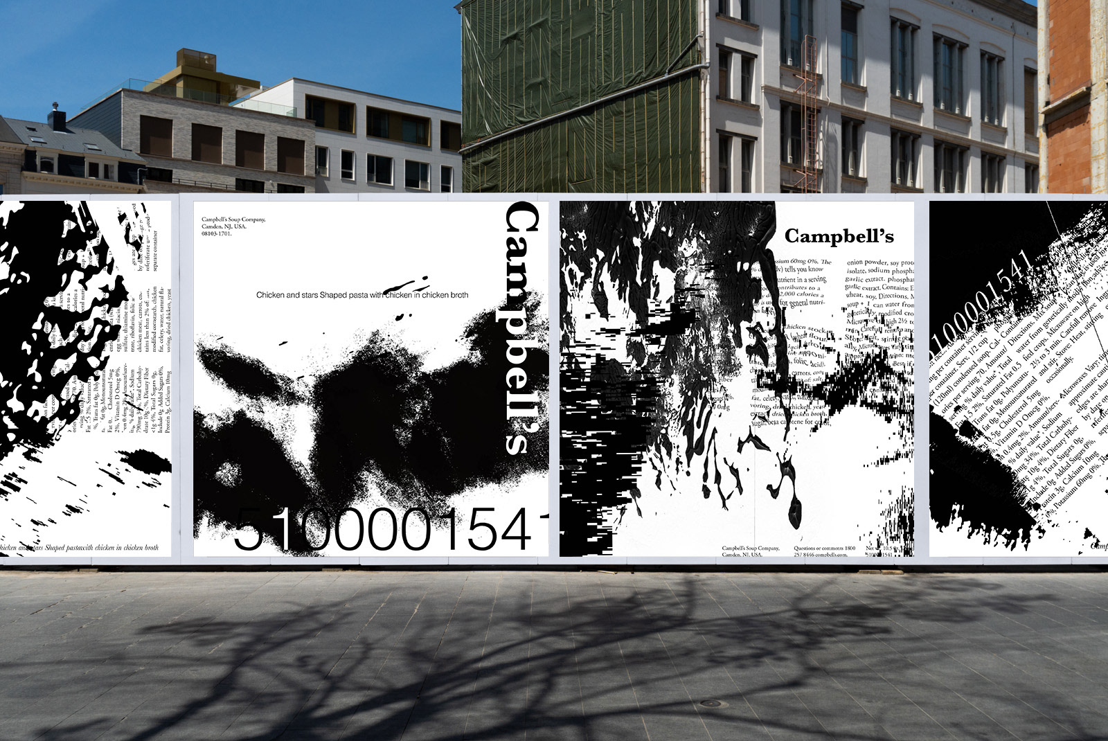
Introduction
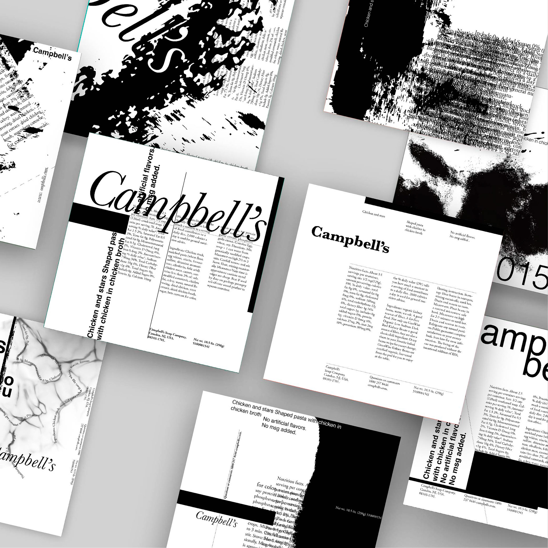
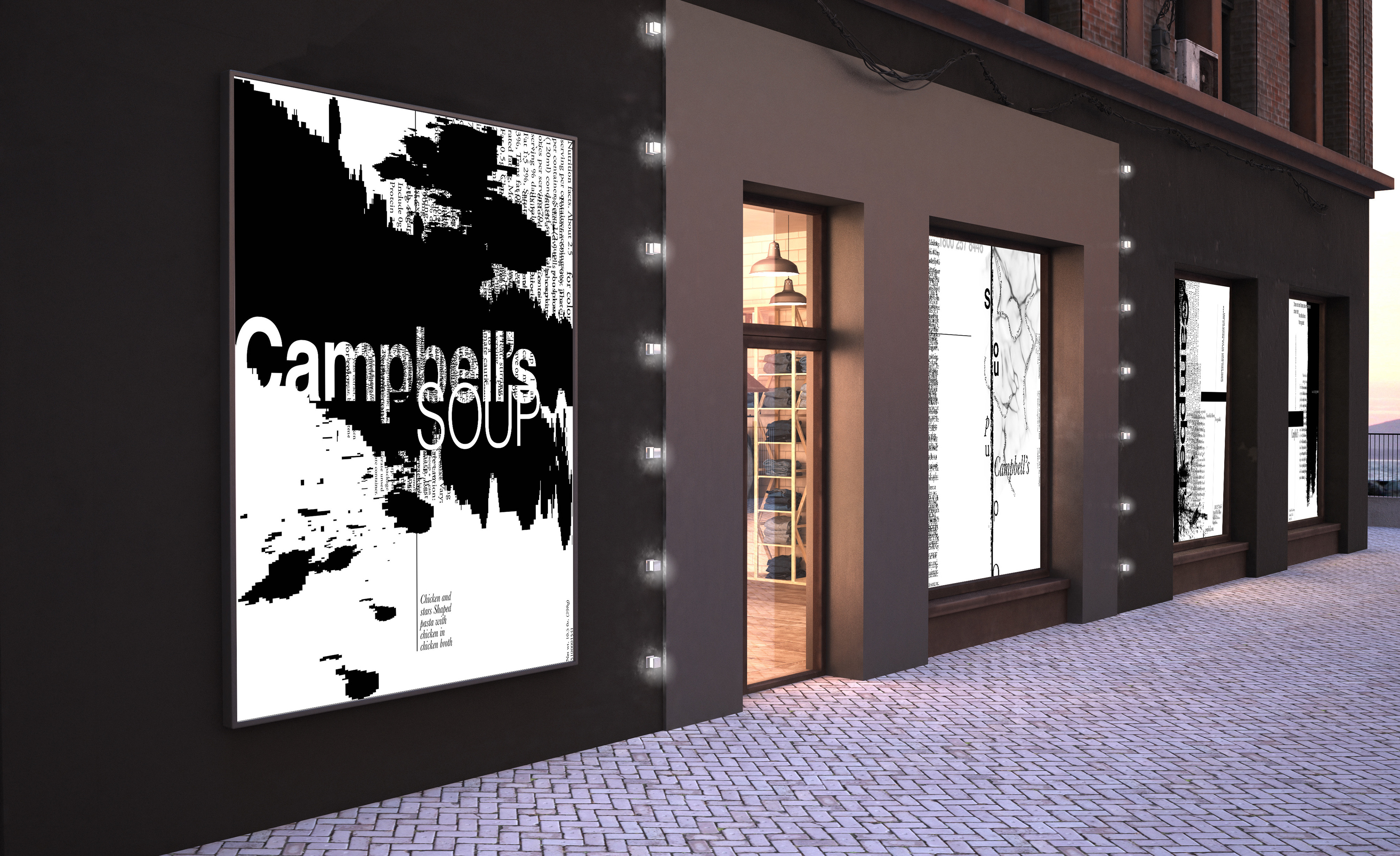
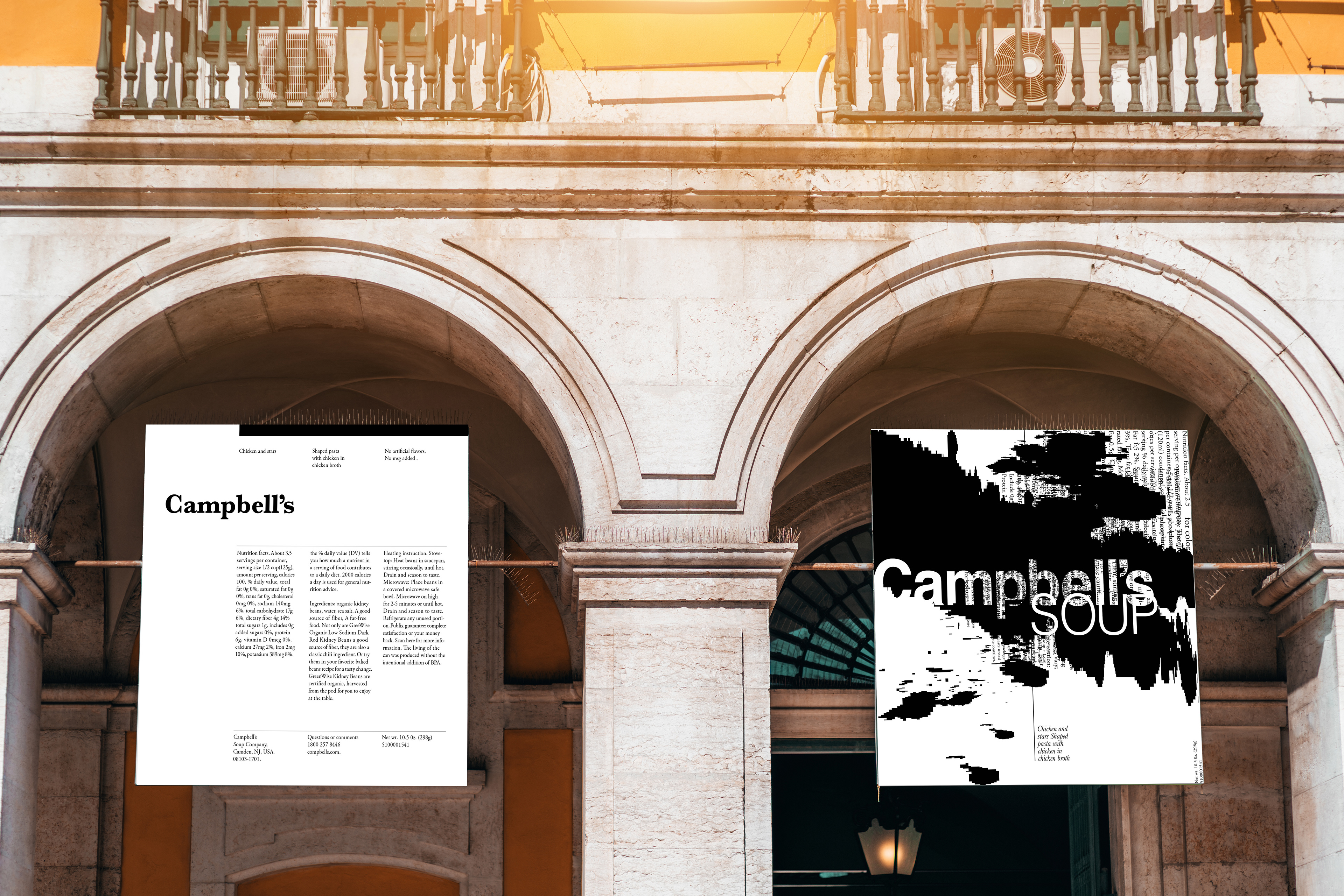
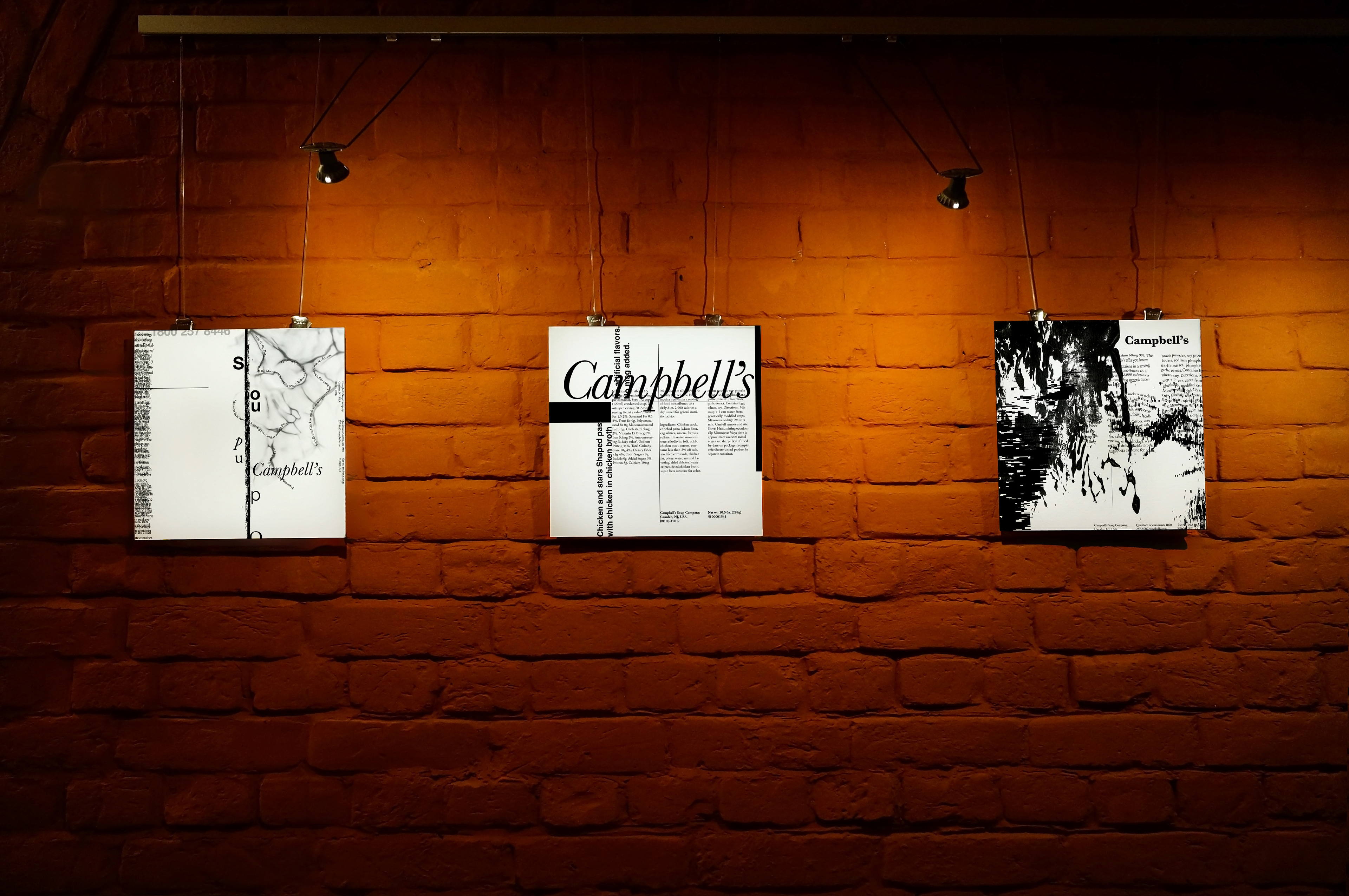
I explored typography, grid, and layout using Campbell’s Shaped Pasta with Chicken in Chicken Broth wrapper. I adjusted the size and weight of elements and later incorporated lines and textures to shift from a clean design to a more expressive and visually engaging one.
The Challenge
The challenge was to evolve Campbell’s Shaped Pasta wrapper design from a clean layout to a more expressive and visually engaging one while ensuring readability.
The Solution
The solution was to adjust typography, sizes, and weights and add lines and textures to create a more expressive and visually engaging design while maintaining readability.
Project Type
Print & Publication Design
Motion Design
Motion Design
Duration
2 months (Winter 2024)
Independent/Team
Independent
Tools
Photoshop, Indesign, Illustrator
And After Effects
And After Effects